The example app's user interface (UI) for creating a new book record looks as in Figure 7.2 below.
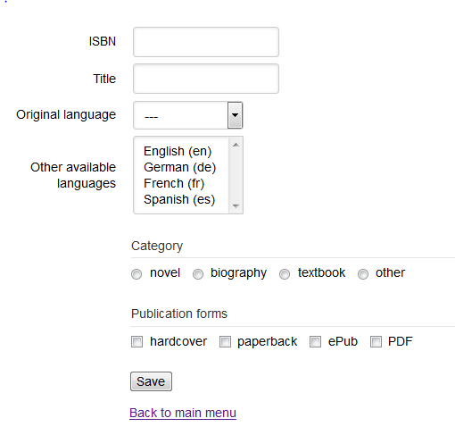
Notice that the UI contains four choice widgets:
a single selection list for the attribute
originalLanguage,a multiple selection list for the attribute
otherAvailableLanguages,a radio button group for the attribute
category, anda checkbox group for the attribute
publicationForms.
We use HTML selection lists for rendering the enumeration
attributes originalLanguage and
otherAvailableLanguages in the HTML forms in
createBook.html and
upateBook.html. Since the attribute
otherAvailableLanguages is multi-valued, we need a
multiple selection list for it, as
shown in the following HTML code:
<form id="Book">
 <div><label>ISBN:
   <input name="isbn" type="text" /></label></div>
 <div><label>Title:
   <input name="title" type="text" /></label></div>
 <div><label>Original language:
   <select name="originalLanguage"></select>
 </label></div>
 <div class="multi-sel"><label>Also available in:
   <select name="otherAvailableLanguages"
    multiple="multiple" rows="4"></select>
 </label></div>
  ...
 <div><button type="submit" name="commit">Save
   </button></div>
</form>
While we define the select container elements for
these selection lists in the HTML code of
createBook.html and
upateBook.html, we fill in their
option child elements dynamically in
v/createBook.mjs and
v/updateBook.mjs with the help of the utility
method fillSelectWithOptions.
In the case of a single select element, the user's
single-valued selection can be retrieved from the value
attribute of the select element, while in the case of a
multiple select element, the user's multi-valued selection
can be retrieved from the selectedOptions attribute of the
select element.
Notice that the div element containing the multiple
selection list for otherAvailableLanguages has the
class value "multi-sel", which is used for defining
specific CSS rules that adjust the element's size.
Since the enumeration attributes category and
publicationForms do not have more than seven possible
values, we can use a radio button
group and a checkbox group
for rendering them in an HTML-form-based UI. These choice widgets are
formed with the help of the container element fieldset and
its child element legend as shown in the following HTML
fragment:
<form id="Book">
 ...
 <fieldset data-bind="category">
   <legend>Category</legend></fieldset>
 <fieldset data-bind="publicationForms">
   <legend>Publication forms</legend></fieldset>
 <div><button type="submit" name="commit">Save
   </button></div>
</form>
Notice that we use a custom attribute data-bind for
indicating to which attribute of the underlying model class the choice
widget is bound.
In the same way as the option child elements of a
selection list, also the labeled input child
elements of a choice widget are created dynamically with the help of the
utility method createChoiceWidget in
v/createBook.js and
v/updateBook.js.
const formEl = document.forms["Book"],
    origLangSelEl = formEl["originalLanguage"],
    otherAvailLangSelEl = formEl["otherAvailableLanguages"],
    categoryFieldsetEl = formEl.querySelector(
        "fieldset[data-bind='category']"),
    pubFormsFieldsetEl = formEl.querySelector(
        "fieldset[data-bind='publicationForms']"),
    saveButton = formEl["commit"];
// load all book records
Book.retrieveAll();
// set up the originalLanguage selection list
fillSelectWithOptions( origLangSelEl, LanguageEL.labels);
// set up the otherAvailableLanguages selection list
fillSelectWithOptions( otherAvailLangSelEl, LanguageEL.labels);
// set up the category radio button group
createChoiceWidget( categoryFieldsetEl, "category", [],
    "radio", BookCategoryEL.labels, true);
// set up the publicationForms checkbox group
createChoiceWidget( pubFormsFieldsetEl, "publicationForms", [],
    "checkbox", PublicationFormEL.labels);
Notice that like a selection list implemented with the HTML
select element that provides the user's selection in the
value or selectedOptions attribute, our choice
widgets also need a DOM attribute that holds the user's single- or
multi-valued choice. We dynamically add a custom attribute
data-value to the choice widget's fieldset
element for this purpose in createChoiceWidget.
Since choice widgets do not allow arbitrary user input, we do not have to check constraints such as range constraints or pattern constraints on user input, but only mandatory value constraints. This allows simplifying responsive validation in the UI.
In our example app, the enumeration attributes
originalLanguage, category and
publicationForms are mandatory, while
otherAvailableLanguages is optional.
In the case of a mandatory
single-valued enumeration attribute like
originalLanguage rendered as a single selection list, we
can enforce a choice, and thus the mandatory value constraint, by not
offering an empty or void option among the option
sub-elements of the select element. If the attribute is
rendered as a radio button group, we can enforce a choice, and thus the
mandatory value constraint, in the create use case by initially setting the
checked attribute of the first radio button to
true and not allowing the user to directly uncheck a
button. In this way, if the user doesn't check any button, the first one
is the default choice.
In the case of an optional
single-valued enumeration attribute rendered as a
single-selection list, we need to include an empty or void option (e.g.,
in the form of a string like "---"). If the attribute is rendered as a
radio button group, we do not check any button initially and we need to
allow the user to directly uncheck a button with a mouse click in a
click event listener.
In the case of a mandatory
multi-valued enumeration attribute like
publicationForms rendered as a multiple-selection list or
checkbox group, we need to check if the user has chosen at least one
option. Whenever the user selects or unselects an option in a
select element, a change event is raised by
the browser, so we can implement the responsive mandatory value
constraint validation as an event listener for change
events on the select element, by testing if the list of
selectedOptions is empty. If the attribute is rendered as a
checkbox group, we need an event listener for click events
added on the fieldset element and testing if the widget's
value set is non-empty, as shown in the following example code fragment:
pubFormsFieldsetEl.addEventListener("click", function () {
  const val = pubFormsFieldsetEl.getAttribute("data-value");
  formEl.publicationForms[0].setCustomValidity(
    (!val || Array.isArray(val) && val.length === 0) ?
      "At least one publication form must be selected!":"" );
});
Notice that the HTML5 constraint validation API does not allow to
indicate a constraint violation on a fieldset element (as
the container element of a choice widget). As a workaround, we use the
first checkbox element of the publicationForms choice
widget, which can be accessed with
formEl.publicationForms[0], for invoking the
setCustomValidity method that indicates a constraint
violation if its argument is a non-empty (message) string.
You can run the enumeration app from our server or download the code as a ZIP archive file.