The widgets used for data input and output in a (CRUD) data
management user interface (UI) normally correspond to properties defined
in a model class of an app. We have to distinguish between (various types
of) input fields corresponding to
(various kinds of) attributes, and
choice widgets (such as selection lists) corresponding to enumeration attributes or to reference properties. Representing reference
properties in the UI with select controls, instead of
input fields, prevents the user from entering invalid ID
references, so it takes care of referential
integrity.
In general, a single-valued reference property can be rendered as a single-selection list in the UI, no matter how many objects populate the reference property's range, from which one specific choice is to be made. If the cardinality of the reference property's range is sufficiently small (say, not greater than 7), then we can also use a radio button group instead of a selection list.
A multi-valued
reference property can be rendered as a multiple-selection list in the UI.
However, the corresponding multiple-select control of HTML is
not really usable as soon as there are many (say, more than 20) different
options to choose from because the way it renders the choice is visually
too scattered. In the special case of having only a few (say, no more than
7) options, we can also use a checkbox group instead of a
multiple-selection list. But for the general case of having in the UI a
list containing all associated objects chosen from the reference
property's range class, we need to develop a special UI widget that allows
to add (and remove) objects to (and from) a list of chosen objects.
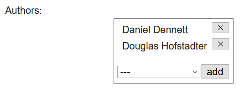
Such a multi-selection widget consists of
an HTML list element containing the selected (associated) objects, where each list item has a push button for removing the object from the selection;
a single-
selectcontrol that, in combination with a push button, allows to add a new associated object from the range class of the multi-valued reference property.
